## 필요한 라이브러리들을 불러옵니다.
import matplotlib.pyplot as plt
from matplotlib.ticker import (MultipleLocator, AutoMinorLocator, FuncFormatter)
import seaborn as sns
import numpy as np
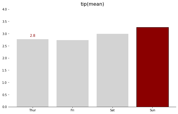
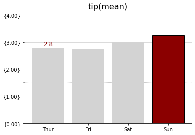
# 시각화코드 함수로 생성 시각화코드 함수로 생성 defplot_example(ax, zorder=0): ax.bar(tips_day["day"], tips_day["tip"], color="lightgray", zorder=zorder) # 요일별 평균데이터를 bar plot으로 만들기 ax.set_title("tip (mean)", fontsize=16, pad=12) # 그래프 타이틀 지정옵션
# Values h_pad = 0.1# 높이 여백설정 옵션 / 입력형태 : float for i inrange(4): # 반복문 4번 실행 fontweight = "normal"# 글자 굵기 노말 color = "k"# 색상지정 옵션 if i == 3: # 조건문 i가 3이면 fontweight = "bold"# 글자 굵기 굵게 color = "darkred"# 색상 지정 옵션
tips = sns.load_dataset("tips") # 예시로 seaborn의 tips 데이터 불러오기
tips_day = tips.groupby("day").mean().reset_index() # groupby를 이용해 요일별 평균 데이터 생성
print(tips_day) # 요일별 평균 데이터 만든것을 출력ips = sns.load_dataset("tips") # 예시로 seaborn의 tips 데이터 불러오기
tips_day = tips.groupby("day").mean().reset_index() # groupby를 이용해 요일별 평균 데이터 생성
print(tips_day) # 요일별 평균 데이터 만든것을 출력
    day  total_bill       tip      size
0  Thur   17.682742  2.771452  2.451613
1   Fri   17.151579  2.734737  2.105263
2   Sat   20.441379  2.993103  2.517241
3   Sun   21.410000  3.255132  2.842105
ax.yaxis.set_major_locator(MultipleLocator(1)) # major tick을 1 단위로 설정 ax.yaxis.set_major_formatter(formatter) # major tick format 지정 (오류가 나면 matplotlib upgrade) ax.yaxis.set_minor_locator(MultipleLocator(0.5)) # minor tick을 0.5 단위로 지정